Art / October 2017
November 2017 | September 2017-
-
Creepy Victorians
- Katherine Mansfield House
- There’s something about historic Victorian homes that modern visitors find slightly unnerving. Why is that, and why are so many aspects of the Victorian life now associated with creepiness?
- Accepted from KMH Blog by feedreader
- Automatically tagged as:
- heritage-buildings
- museums-and-galleries
- thorndon
Katherine Mansfield House and Garden, 25, Tinakori Road, Wadestown, Wellington, Wellington City, Wellington, 6011, New Zealand (OpenStreetMap)
-
-
-
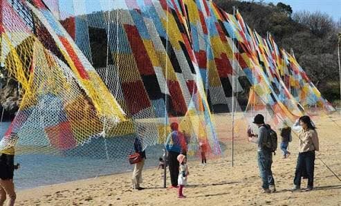
Knitting the Sky in Wellington
- Urban Dream Brokerage
- <figure class=" sqs-block-image-figure intrinsic " > “Knitting nets is universal.
- Accepted from Urban Dream Brokerage Blog by tonytw1
- Automatically tagged as:
- art
- singing
-
-
-
On World Homeless Day, buy a welcome pack for someone who has just got a home
- Downtown Community Ministry
- 96 On World Homeless Day, buy a welcome pack for someone who has just got a home p{ margin:10px 0; padding:0; } table{ border-collapse:collapse; } h1,h2,h3,h4,h5,h6{ display:block; margin:0; padding:0; } img,a img{ border:0; height:auto; outline:none; text-decoration:none; } body,#bodyTable,#bodyCell{ height:100%; margin:0; padding:0; width:100%; } .mcnPreviewText{ display:none !important; } #outlook a{ padding:0; } img{ -ms-interpolation-mode:bicubic; } table{ mso-table-lspace:0pt; mso-table-rspace:0pt; } .ReadMsgBody{ width:100%; } .ExternalClass{ width:100%; } p,a,li,td,blockquote{ mso-line-height-rule:exactly; } a[href^=tel],a[href^=sms]{ color:inherit; cursor:default; text-decoration:none; } p,a,li,td,body,table,blockquote{ -ms-text-size-adjust:100%; -webkit-text-size-adjust:100%; } .ExternalClass,.ExternalClass p,.ExternalClass td,.ExternalClass div,.ExternalClass span,.ExternalClass font{ line-height:100%; } a[x-apple-data-detectors]{ color:inherit !important; text-decoration:none !important; font-size:inherit !important; font-family:inherit !important; font-weight:inherit !important; line-height:inherit !important; } #bodyCell{ padding:10px; } .templateContainer{ max-width:600px !important; } a.mcnButton{ display:block; } .mcnImage{ vertical-align:bottom; } .mcnTextContent{ word-break:break-word; } .mcnTextContent img{ height:auto !important; } .mcnDividerBlock{ table-layout:fixed !important; } body,#bodyTable{ background-color:#FAFAFA; } #bodyCell{ border-top:0; } .templateContainer{ border:0; } h1{ color:#202020; font-family:Helvetica; font-size:26px; font-style:normal; font-weight:bold; line-height:125%; letter-spacing:normal; text-align:left; } h2{ color:#202020; font-family:Helvetica; font-size:22px; font-style:normal; font-weight:bold; line-height:125%; letter-spacing:normal; text-align:left; } h3{ color:#202020; font-family:Helvetica; font-size:20px; font-style:normal; font-weight:bold; line-height:125%; letter-spacing:normal; text-align:left; } h4{ color:#202020; font-family:Helvetica; font-size:18px; font-style:normal; font-weight:bold; line-height:125%; letter-spacing:normal; text-align:left; } #templatePreheader{ background-color:#FAFAFA; background-image:none; background-repeat:no-repeat; background-position:center; background-size:cover; border-top:0; border-bottom:0; padding-top:9px; padding-bottom:9px; } #templatePreheader .mcnTextContent,#templatePreheader .mcnTextContent p{ color:#656565; font-family:Helvetica; font-size:12px; line-height:150%; text-align:left; } #templatePreheader .mcnTextContent a,#templatePreheader .mcnTextContent p a{ color:#656565; font-weight:normal; text-decoration:underline; } #templateHeader{ background-color:#FFFFFF; background-image:none; background-repeat:no-repeat; background-position:center; background-size:cover; border-top:0; border-bottom:0; padding-top:9px; padding-bottom:0; } #templateHeader .mcnTextContent,#templateHeader .mcnTextContent p{ color:#202020; font-family:Helvetica; font-size:16px; line-height:150%; text-align:left; } #templateHeader .mcnTextContent a,#templateHeader .mcnTextContent p a{ color:#2BAADF; font-weight:normal; text-decoration:underline; } #templateBody{ background-color:#FFFFFF; background-image:none; background-repeat:no-repeat; background-position:center; background-size:cover; border-top:0; border-bottom:2px solid #EAEAEA; padding-top:0; padding-bottom:9px; } #templateBody .mcnTextContent,#templateBody .mcnTextContent p{ color:#202020; font-family:Helvetica; font-size:16px; line-height:150%; text-align:left; } #templateBody .mcnTextContent a,#templateBody .mcnTextContent p a{ color:#2BAADF; font-weight:normal; text-decoration:underline; } #templateFooter{ background-color:#FAFAFA; background-image:none; background-repeat:no-repeat; background-position:center; background-size:cover; border-top:0; border-bottom:0; padding-top:9px; padding-bottom:9px; } #templateFooter .mcnTextContent,#templateFooter .mcnTextContent p{ color:#656565; font-family:Helvetica; font-size:12px; line-height:150%; text-align:center; } #templateFooter .mcnTextContent a,#templateFooter .mcnTextContent p a{ color:#656565; font-weight:normal; text-decoration:underline; } @media only screen and (min-width:768px){ .templateContainer{ width:600px !important; } } @media only screen and (max-width: 480px){ body,table,td,p,a,li,blockquote{ -webkit-text-size-adjust:none !important; } } @media only screen and (max-width: 480px){ body{ width:100% !important; min-width:100% !important; } } @media only screen and (max-width: 480px){ #bodyCell{ padding-top:10px !important; } } @media only screen and (max-width: 480px){ .mcnImage{ width:100% !important; } } @media only screen and (max-width: 480px){ .mcnCartContainer,.mcnCaptionTopContent,.mcnRecContentContainer,.mcnCaptionBottomContent,.mcnTextContentContainer,.mcnBoxedTextContentContainer,.mcnImageGroupContentContainer,.mcnCaptionLeftTextContentContainer,.mcnCaptionRightTextContentContainer,.mcnCaptionLeftImageContentContainer,.mcnCaptionRightImageContentContainer,.mcnImageCardLeftTextContentContainer,.mcnImageCardRightTextContentContainer{ max-width:100% !important; width:100% !important; } } @media only screen and (max-width: 480px){ .mcnBoxedTextContentContainer{ min-width:100% !important; } } @media only screen and (max-width: 480px){ .mcnImageGroupContent{ padding:9px !important; } } @media only screen and (max-width: 480px){ .mcnCaptionLeftContentOuter .mcnTextContent,.mcnCaptionRightContentOuter .mcnTextContent{ padding-top:9px !important; } } @media only screen and (max-width: 480px){ .mcnImageCardTopImageContent,.mcnCaptionBlockInner .mcnCaptionTopContent:last-child .mcnTextContent{ padding-top:18px !important; } } @media only screen and (max-width: 480px){ .mcnImageCardBottomImageContent{ padding-bottom:9px !important; } } @media only screen and (max-width: 480px){ .mcnImageGroupBlockInner{ padding-top:0 !important; padding-bottom:0 !important; } } @media only screen and (max-width: 480px){ .mcnImageGroupBlockOuter{ padding-top:9px !important; padding-bottom:9px !important; } } @media only screen and (max-width: 480px){ .mcnTextContent,.mcnBoxedTextContentColumn{ padding-right:18px !important; padding-left:18px !important; } } @media only screen and (max-width: 480px){ .mcnImageCardLeftImageContent,.mcnImageCardRightImageContent{ padding-right:18px !important; padding-bottom:0 !important; padding-left:18px !important; } } @media only screen and (max-width: 480px){ .mcpreview-image-uploader{ display:none !important; width:100% !important; } } @media only screen and (max-width: 480px){ h1{ font-size:22px !important; line-height:125% !important; } } @media only screen and (max-width: 480px){ h2{ font-size:20px !important; line-height:125% !important; } } @media only screen and (max-width: 480px){ h3{ font-size:18px !important; line-height:125% !important; } } @media only screen and (max-width: 480px){ h4{ font-size:16px !important; line-height:150% !important; } } @media only screen and (max-width: 480px){ .mcnBoxedTextContentContainer .mcnTextContent,.mcnBoxedTextContentContainer .mcnTextContent p{ font-size:14px !important; line-height:150% !important; } } @media only screen and (max-width: 480px){ #templatePreheader{ display:block !important; } } @media only screen and (max-width: 480px){ #templatePreheader .mcnTextContent,#templatePreheader .mcnTextContent p{ font-size:14px !important; line-height:150% !important; } } @media only screen and (max-width: 480px){ #templateHeader .mcnTextContent,#templateHeader .mcnTextContent p{ font-size:16px !important; line-height:150% !important; } } @media only screen and (max-width: 480px){ #templateBody .mcnTextContent,#templateBody .mcnTextContent p{ font-size:16px !important; line-height:150% !important; } } @media only screen and (max-width: 480px){ #templateFooter .mcnTextContent,#templateFooter .mcnTextContent p{ font-size:14px !important; line-height:150% !important; } } View this email in your browser When homeless people move into a home... Buy them a Welcome Pack. Today is World Homeless Day. At DCM we call the people we work with taumai, meaning to settle. One way you could mark the day would be to purchase a 'welcome pack' for our taumai when they move from homelessness into their new home. Sustaining tenancies once taumai have been housed is a vital part of the work we do, so we’ve put together a ‘welcome pack’ consisting of items to help them care for their whare, and to make their new house into a home. $100 will fund one pack. If you are able to support taumai in this way, please click the link below. If donating directly to our bank account use 'Welcome' as a code. Any donations would be appreciated. https://www.dcm.org.nz/support-dcm/ Because together, we CAN end homelessness in Wellington. Donate Now <!-- --> To read some great stories about DCM's work, click here www.dcm.org.nz/success-stories. <!-- --> Copyright © 2017 DCM, All rights reserved. Want to change how you receive these emails? You can update your preferences or unsubscribe from this list
- Accepted from DCM alerts archive by feedreader
- Tagged as:
- art
- media
- people
- wellington
-
-
-
Public programme: October – December 2017
- Te Pātaka Toi Adam Art Gallery
- Friday 13 October 6-8pm Adam Art Gallery Exhibition opening Please join us for the opening of our final exhibitions for 2017: From the College Collection What Remains, The Karori Commission Anna Sanderson, Gavin Hipkins, Philip Kelly Future Islands: The New Zealand Exhibition at the 2016 Venice Architecture Biennale Apparitions: the photograph and its image Curated by Geoffrey Batchen and his Honours students
- Accepted from Adam Art Gallery feed
- Tagged as:
- karori
Adam Art Gallery, Hunter Car Park, Kelburn, Wellington, Wellington City, Wellington, 6145, New Zealand (OpenStreetMap)
-